Head-to-Tail
We really like how the Animal Wellness Center’s business cards came out! When the owners of the Turkey Creek Animal Hospital expanded their practice we had the opportunity to brand their new animal health clinic. We were looking to subtly connect the two, without making the identities too similar. Using the “A” as a silhouette of a dog, we highlight their focus on overall health of the animal – from head to tail to their logo and this business card. With the added diecut these cards are fun to hold and hand out!

n00ted: Dr. No
:: As we begin this run of creating 23 Bond posters, we thought we’d add a Blog post to highlight something we notice and thought was interesting/worth sharing. This is the first installment to our James Bond n00ted postes ::
James Bond opening sequences have always been beautiful productions unto themselves.This was as no less true for Dr. No 50 years ago. During Dr. No’s titles we couldn’t help but notice a striking similarity between the colorful dancers and those featured in Apple’s iPod silhouette commercials. See for yourself! And check out the brilliant title design work by Maurice Binder.


50 years of 007
To finally have Fifty years of Bond awesomeness in our hands is beyond exiting! Flipping through the blu-ray collection of disks brought back feelings of nostalgia and awe; It’s been a long time since we watched some of the earlier Bond movies.
It wasn’t until the day after watching Dr. No on October 5th that we realized we’d had viewed it on THE EXACT release date of the film – but 50 years later. One of those moments that makes you go woah….
We were inspired by that coincidence, and an idea was born: Let’s watch a movie a day and create a poster after watching each movie, and have it be the countdown to SKYFALL. We are talking 23 movies y’all, in 23 days. This design challenge is going to be a pleasure as well as a creative push and we are thrilled to get cranking, and hope you follow along: 007.herringhaggis.com.

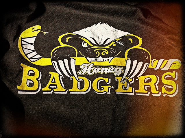
It’s Pretty Badass
Randell’s awesome The Crazy Nastyass Honey Badger video got thrown out as a potential hockey team name, but unlike many of the other candidates, this one stuck and we got to work putting a design together. We put a single sketch in front of the team and everyone was excited to know how soon the art could be done and jerseys printed. After producing 9 type options (for them to pick the first one typeset…isn’t that the way it always goes) we had us some sweet jerseys.
What?? You aren’t one of the 42,000,000 + viewers who have seen the original Crazy Nastyass Honey Badger video. Get to watching. Or if you’ve already seen it, why here’s your chance to watch it again.
[youtube=http://www.youtube.com/watch?v=4r7wHMg5Yjg&w=640&h=360]This is Awesome!
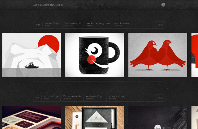
We are honored and excited to announce that Herring’s (aka Maria Taylor’s) illustrations were featured as No. 10 on 356 awesome designers this week! 365 awesome designers is a project by mment industries, where he will publish a designer every day for the next year. Check out the site daily…it’s awesome!
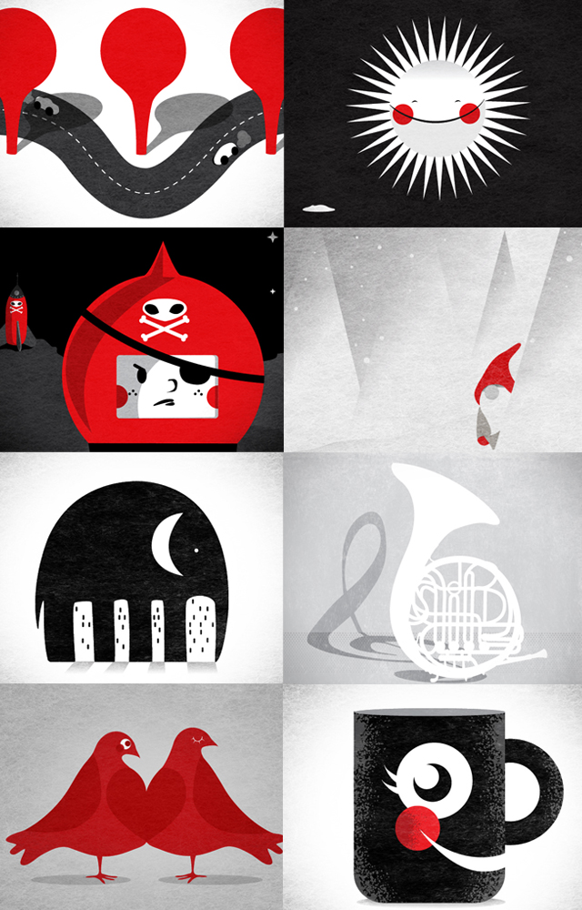
23 and counting…
Wednesday Lunch Read(s) started as a weekly email with links to interesting articles, videos and infographics that just begged to be shared.
The emails got old after a while, so in August, 2011, Wednesday Lunch Read(s) got a home on the Web. Moving it to a blog format allowed for that weeks theme/topic to be personalized with its own illustration. By picking a topic of interest to learn more about and then doing the research and exploring of that topic has been a great learning experience. The creative challenge of illustrating each topic in a way to engage others to take interest and dig deeper has also been hugely rewarding.
Today, 23 weeks and 23 posts later, WLR(s) are still going strong!
Got an topic you think we should cover on the blog? Please send them our way: hello@herringhaggis.com
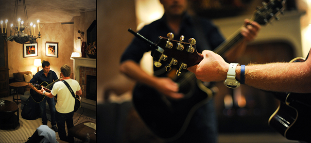
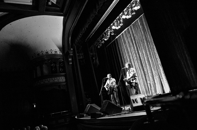
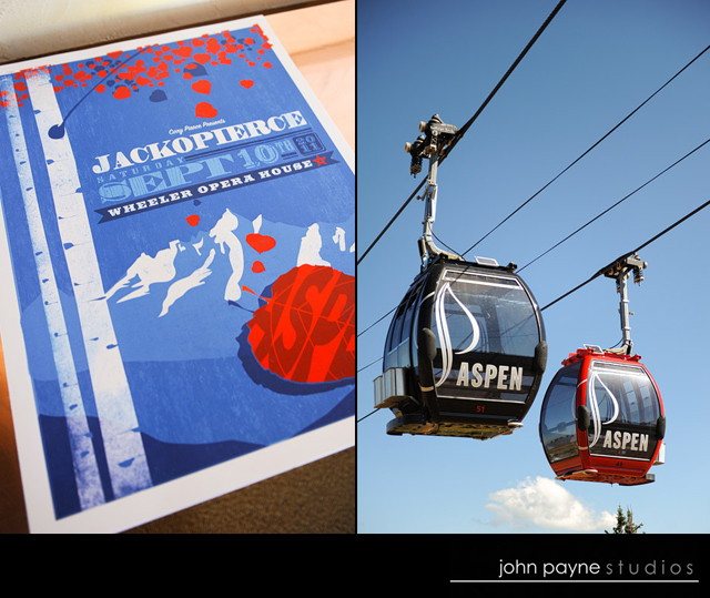
WISH We Could Have Been There…
Herring and Haggis didn’t get to make it to the Jackopierce concert in Aspen. (We’ll be at the next Destination Show, which…well… we can’t say yet) Thankfully John Payne, a photographer with a great eye, was around for the weekend to capture the events and below are some of the shots. Be sure to check out his photos from Europe here and here as well as his website.

Wednesday Lunch Read(s) on Best About Pages
We’re excited and honored to announce that the About Page for Herring’s blog Wednesday Lunch Read(s) was featured on Best About Pages this week! Founded by Jeremy Mitchell, Best About Pages is a website showcasing the best of the best about pages on the web – check it out and be inspired!
Wednesday Lunch Read(s) delivers a curated set of themed and interesting links every Wednesday, along with a custom illustration to fit the flavor of the week.

Instructional Construction
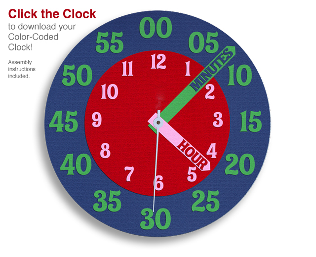
One of our favorite paper mills, Neenah Paper was running a contest to create a clock face using their ESSE and OXFORD papers. Right around this time, both of our boys were struggling to understand why “when the big hand is on the 8, it’s actually 40.” It’s not an easy thing to explain in words while pointing to a clock on the wall. BUT, to use color and numbers…?! Well now we were on to something!
Building a clock where the kids could move the hands and see the relationship to the numbers created an almost immediate comprehension. As if THAT was not rewarding enough, since the contest and the exposure the clock got, several teachers have gotten in touch with us that they found this a novel idea for teaching reading a clock, and had adopted it into their classrooms.
Therefore, as a follow-up to the project, you can now download your very own Color-Coded Clock to assemble. ENJOY!