Animal Wellness Center

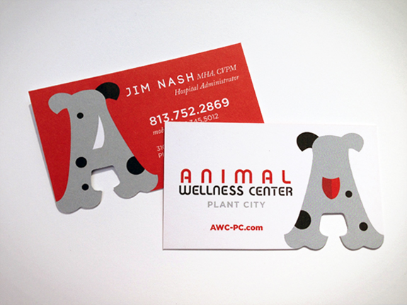
When the Turkey Creek Animal Hospital expanded to the Animal Wellness Clinic they asked us to create a new brand image for this revamped clinic. Playing off the “A” shape as we had done for the Turkey Creek “T” worked so nicely that we couldn’t decide which view was cuter: the front or the back of the “A”? So we ended up using both! Which one do you like?
